No drop down checkout
This project is an exploration of two ideas: increasing profit by making a form as simple as possible and
granularity, reading newspaper, different reading/interaction speeds
e in sales and . And draws on psychology and lingusitics for many of its details.
Inspiration
- How expedia inreased revenue by $12million by removing one optional input from a form.
- Critique of drop downs by Google Strategist Golden Krishna. TLDR – Don’t use drop downs.
As I got in to the details of the project I was faced with decisions where I was balancing efficiency against trust (appropriate amount of information) – how things have meaning (context), decisions(decisions bad) … and linguistics of time.
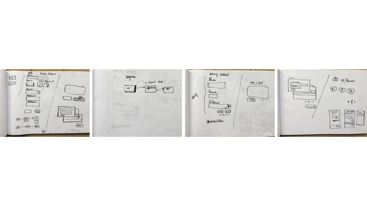
To start I worked up a series of very rough sketches. These are not slick in any way. They are there for me to have get the design process moving. To ask questions and make decisions quickly. They avoid detail and establish an outline before moving into higher fidelity.
I took the sequence of interactions from my sketches and mapped them out in a higher fidelity. From there I could drill deeper into the designs and as I did so a series of questions began to emerge:
- (How) can this be removed?
- Is there a more meaningful context for this?
- Does this build trust in the user?
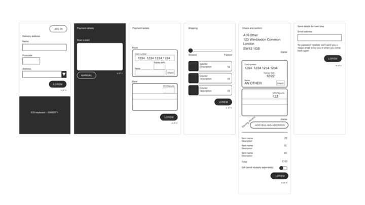
The search button for address auto complete
(How) can this be removed?**
In address lookup form a common design pattern is:
- Enter postcode
- Press search
- Choose address from dropdown list
‘sketch of this pattern’
Saw a button press and a drop down which could be removed and replaced with a pattern which required less work
Enter postcode into postcode box then start typing first line of the address. With these two parameters it should be possible to quickly query and filter through a data base of addresses. A user then has the option to continue typing their address or selecting the autofill option.
This pattern is simpler for a user with an address which is different from the predetermined list. They can avoid an additional step of selecting “enter address manually”, and use the data they have already entered.
The position of the progress bar
Is there a more meaningful context for this?
A form which looks easy will likely improve completion rates and therefore profit. An effective way of doing this is to break a from down in to steps. With each step capture just one type of data at a time, an address for example.
A progress bar is a useful tool in building trust with a user. It signals to them how far they have progressed and how many steps they have left to completion. Without this, they are blind how long a form is and likely give up on it or not enter into it at all.
After exploring various positions for the bar, I choose to place it next to the continue button. The coupling of button and progress bar made each seperate unit more meaningful.
The progress bar is detailed and requires more effort to understand than something simple. Therefore, it is reasonable to assume that it may not be read at all but simply noticed. Just being noticed is still valuable, it affirms trust and is there is a user wants to read deeper. By placing it next to our call to action (CTA). It is more likely to be noticed and it provides context to the CTA. Continue now means, to the next step and through the entire form.
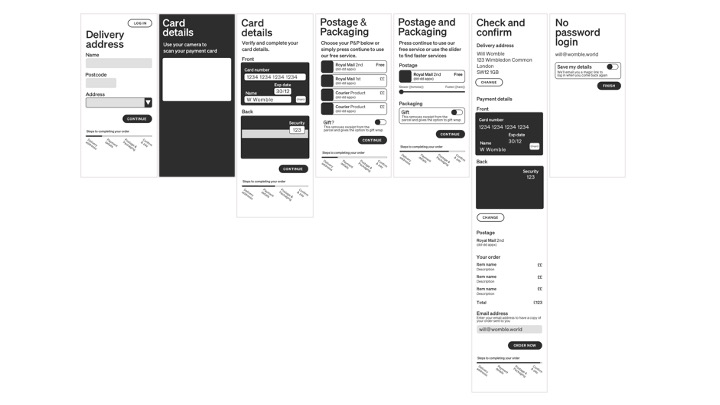
(Choosing) delivery times
1. (How) can this be removed? 2. Is there a more meaningful context for this? 3. Does this build trust in the user?
It is common for different delivery times and costs to be offered to a user. However, our case study and research by psychologist Daniel Kahneman so us that choice is bad.
Choice is difficult, it takes effort. The fewer choices, the greater the completion rates. However, it may still be important to provide the option of different delivery times.
Here we can use an informed default. The cheapest, slowest option. This assumes a user wants to keep their costs to a minimum. If they are in agreement with this, they don’t need to make a choice and can quickly move on to the next step.
However, if the default does not meet their demands then their flow is interrupted and they slow down. Now they can find an element which they can use to find an option to better meet their demands.
A drop down could work well here. But part of the challenge of this piece to avoid them. The critique here is that they do not necessarily have a logical order and they have a poor mobile experience. That is, on mobile it is not possible to see the whole list, only current selection +/- 3.
Instead of a dropdown I chose a slider. Fast and slow, naturally maps on to it. Without thinking, I placed the slowest, cheapest option on the left and the fastest option on the right. But this began to itch at me. Is this intuitive?
Time is a moving object
For my answer, I turned to Metaphors We Live By, by Lakoff and Johnson Linguistics. There work analyses language and how it is derived from metaphors stemming from the body and its movements.
Relating to time, they find two metaphors. The body as an object moving through time or time as an object moving towards the body. In both of these metaphors tomorrow is closer than the next day, which is closer than the day after.
As we read left to right, we naturally position the present on the left, at the start of the slider and the future on the right. Therefore, it makes sense to map fastest delivery times to the left of the slider and slowest to the right.
So, where the default is the slowest cheapest option, the slider should be pre-set to the right and the user can draw it towards them to find the faster delivery options.
Check and confirm
3. Does this build trust in the user? We want the user to check their delivery and billing data is correct and provide them the opportunity to edit it. However, this should be a tertiary option. Assuming they entered it correctly we don’t want to unnecessarily distract them. Therefore the edit buttons are smaller and positioned to the left with the primary CTA at the bottom on the right.
No password login
1. (How) can this be removed? 3. Does this build trust in the user?
Finally a no-password login. As we have already captured their email address and we want to promote saving their details to promote repeat business. Asking the user to create and enter a password at this stage would be cumbersome. Simply inviting them to save their details and sending a magic link when they want to log in keeps data entry to a mimimum.
Large bold font, both stylistic and to address useability issues in an older often overlooked population.
Final renders
- Learning that by removing one optional input from a form resulted in $11 million increase in sales
- A talk by Google Strategist Golden Krishna and Eric Campbell at SXSW. on the flaws of dropdown
As I got into it I was confronted with issues of trust, choice, context and the linguistics of time.