Programming software for musicians
How I bridged a culture gap to make space for user-centred design
Summary
Situation
A team at Sussex University are building a web-app for programming music, “Live coding”. I was brought into help revamp its UI and interaction patterns.
Process
The brief concealed many assumptions. Important information wasn’t forthcoming because of an
established work culture. Until this point, everyone in the project had been involved for years. And they
were all academic experts in the field. So it was assumed that anyone involved had the same depth of knowledge.
The initial challenge was initial challenge was to build relationships so that I could understand
the product and its road map. To do this, I had to sandbox the creative process and make a space
for naieve questions and incorrect answers.
I needed someone akin to a product owner. One member of the team who I could arrange design reviews with. These were scheduled in 2 week sprints. It was important that they did not share any design work without permission.
Each review revealed more information which I used to design in greater detail. This cycle lead to a dialogue founded on trust. This, in turn gave space for naieve, user-centred questions.
These questions would eventually reveal the major challenge(s) a user faced when using the product, as well detailed information about its roadmap. With this, the design lept forward.
I presented it to the team who adopted the redesign. Which has less distractions and allows for navigation through complex musical arrangements.
Below are the key steps in the evolution of the design.
Process in detail
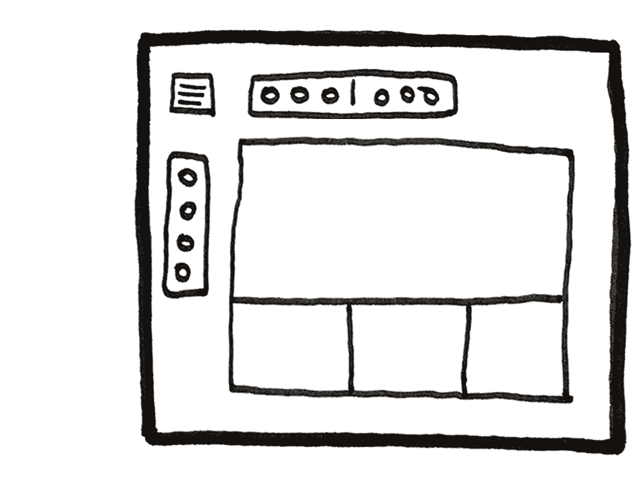
Afford focus
The bulk of a user’s time would be spent inside the dashboard programming music. Therefore, anything which detracted from the programming experience was considered a distraction.
Frequency of use
Interactions which are used infrequently were hidden behind expanding/collapsing menus. The site wide navigation for example. Obviously a user would need to navigate to and from the dashboard. However, once they are programming they don’t need to do this. So, the site wide navigation can be collapsed, likewise with the session setting (volume, save, download etc ).
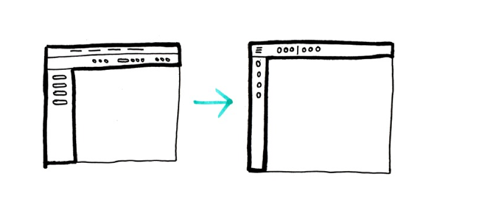
Appropriate levels of detail
We followed the principle of Jakobs law (a user will spend more time on apps other than this) and adopted conventions used in other software: replacing labels with icons and providing more detail, tool tips etc on hover.
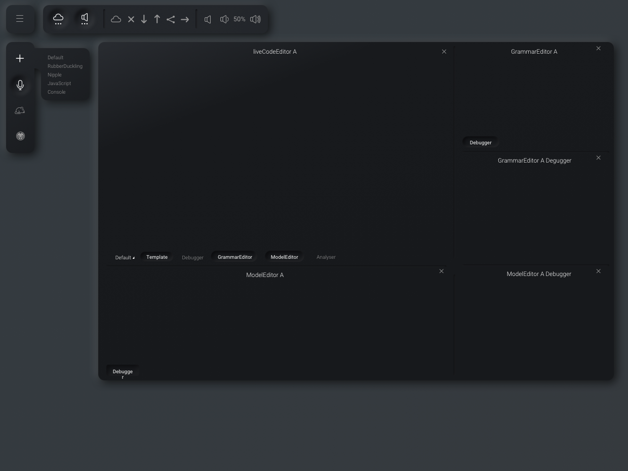
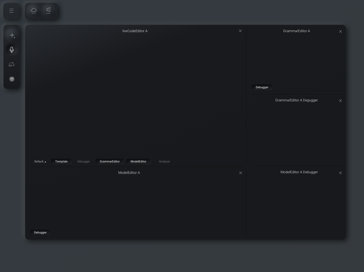
Nesting
The process of live coding requires different languages for different musical sections. Each section is written inside its own text editor. A section can be connected to any number of affect editors, each with their own language.
A musical piece is usually made of many sections (rhythm, strings, percussion, etc). The existing design provides no means for connecting affects to sections. It requires the user to track these relationships. Taxing their working memory which will lead to unnecessary errors.
The solution is to nest affects inside sections. Then presenting context specific options each editor.
Everything is a widget
We referred to these collections of section editor and affects editors as widgets. Then the toolbar became a widget. So too the navigation bar. Suddenly we realised the entire site was a series of different widgets and the information architecture could be redesigned to reflect this.
The user would always land inside the programming environment. The home page, about page, tutorials and docs would all exist as collections of widgets. Significantly, this would allow the user to use the tutorial and docs within their workspace.
Finally, this simple concept became the foundation for a design system. It is a simple metaphor anyone involved in the project could hook on to work to.